Python Template for Plotting Kernel Density Estimates (KDE) of Detrital Zircon U-Pb Data
Interactive bar available to best present your data
Motivation
Being part of a group well-known for applying U-Pb dating on detrital zircons to study sediment routing, my research methods are typically expected to focus on core description, statistical analysis, and luminescence dating. Initially, I assumed that U-Pb data wouldn’t be a major part of my work, as the samples are either from the Ganges or Brahmaputra rivers. However, when examining super sandy, thick sediment gravity flow deposits (most of which are turbidites), the lithofacies of these deposits surprisingly resemble features typical of the Brahmaputra.
This resemblance raises an interesting hypothesis: Could triggering events have occurred upstream in the Brahmaputra River, under favorable external conditions (such as climate-controlled low sea levels), to produce what we now observe as megaturbidites at the distal edge of the Bengal Fan, where our core samples were collected?
Developing a Python-Based KDE Plotting Tool
While there are great tools available for sedimentology data analysis, they are largely based on MATLAB or R. Although I have some familiarity with MATLAB, Python remains my tool of choice. To avoid switching programming environments, I decided to create my own Kernel Density Estimation (KDE) plotting functions in Python. I wanted these plots to meet publication standards, so I used visualization styles from my advisor Mike Blum’s 2018 paper as a reference. (See the paper here). The sample data I’m displaying here is also from that paper, but we’re in the process of collecting new data for future publications!
Setting Up the Data
To get started, you’ll need an Excel workbook for your data. If you plan to plot data from multiple sampling sites, arrange the age data from each site in a separate column, with each column named after the sampling site.
Building a Basic Plot
We’ll start with a very simple plot. Initially, I set the bandwidth hyperparameter to 0.01. This creates a trend that appears somewhat bumpy, so I added a smoothing function to improve the visual appeal. The goal is to use the script below to experiment with both the bandwidth and smoothing factors, finding an optimal balance. Decreasing the bandwidth provides more detail, but can result in a bumpy appearance, where smoothing can help make the plot more visually pleasing while retaining the key features of the data.

Below is a sample script to begin working with and the image is a preview of how the interface looks like. Feel free to adjust the parameters as needed:

import numpy as np
import matplotlib.pyplot as plt
from scipy.stats import gaussian_kde
from scipy.ndimage import gaussian_filter1d
from ipywidgets import interact, widgets

def plot_kde(data_sample, bandwidth, sigma):
    # Generate KDE
    kde = gaussian_kde(data_sample, bw_method=bandwidth)
    x_values = np.linspace(0, 3500, 1000)
    y_values = kde(x_values)

    # Apply smoothing filter
    y_smooth = gaussian_filter1d(y_values, sigma=sigma)

    # Plotting
    plt.figure(figsize=(10, 1.8))

    plt.plot(x_values, y_smooth, color='black', linewidth=1)
    plt.xlabel("Age (Ma)")
    plt.ylabel("Normalized KDE")

    # Set x-axis limits and major ticks
    plt.xlim(0, 3500)
    plt.xticks(np.arange(0, 3501, 500))  # Major ticks every 500

    # Add minor ticks every 100
    plt.gca().xaxis.set_minor_locator(plt.MultipleLocator(100))

    # Customize minor tick appearance
    plt.tick_params(axis='x', which='minor', length=4, color='black')

    # Remove y-axis ticks
    plt.gca().yaxis.set_ticks([])
    plt.gca().yaxis.set_ticklabels([])

    plt.show()

# Create interactive sliders for bandwidth and sigma, and add data_sample as a fixed argument
def interactive_plot(data_sample):
    interact(
        lambda bandwidth, sigma: plot_kde(data_sample, bandwidth=bandwidth, sigma=sigma),
        bandwidth=widgets.FloatSlider(value=0.008, min=0.005, max=0.5, step=0.001,
                                      description='Bandwidth', readout_format='.3f'),
        sigma=widgets.FloatSlider(value=3, min=0, max=10, step=0.5, description='Smooth')
    )
Stacked KDE Plots of Multiple Samples
Simple Stack
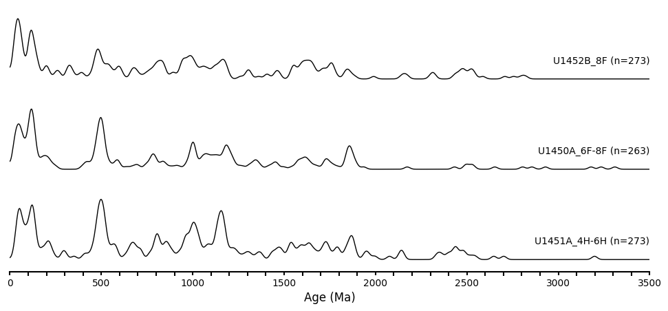
When plotting stacked KDEs of multiple samples, the script will automatically use the column names and sample sizes as labels for each plot. The stacking order follows the sequence of columns in the Excel file, meaning the first column will be plotted at the bottom.
The para_dict is a dictionary where each key corresponds to a sample name, and the values are: 1) the age data, 2) the bandwidth parameter, and 3) the smoothing factor. After experimenting with one sample to determine a comfortable combination of bandwidth and smoothing factor, I found that my samples could share the same values, so I set a default_bandwidth and default_smooth_factor based on this. For cases where samples may require different settings, I recommend updating the para_dict accordingly to fine-tune each sample’s parameters.
"""
    Import Data with defaulted bandwidth and smooth factor
"""
# Load the Excel file
excel_path = "Blum_2018_Bengal_Fan.xlsx"  # Replace with the actual path to your file and put it under the same directory of the script
data = pd.read_excel(excel_path)

# Default values for bandwidth and smooth factor
default_bandwidth = 0.008
default_smooth_factor = 4

# Initialize the param_dict
param_dict = {}

# Process each column to construct the dictionary with column name and valid data count
for column in data.columns:
    # Count the number of non-NaN values in the column
    valid_data_count = data[column].count()
    # Construct the key with column name and valid data count
    key = f"{column} (n={valid_data_count})"
    # Assign the column data to the dictionary, excluding NaN values, along with default parameters
    param_dict[key] = [data[column].dropna().values, default_bandwidth, default_smooth_factor]

print(param_dict.keys())
Define the visualization function
import matplotlib.pyplot as plt
import numpy as np
from scipy.stats import gaussian_kde
from scipy.ndimage import gaussian_filter1d

def plot_stacked_kdes(params, offset, color_blocks=None):
    # Create figure
    plt.figure(figsize=(12, 5))

    # Add color blocks if provided
    if color_blocks is not None:
        for start, end, color in color_blocks:
            plt.axvspan(start, end, color=color, alpha=0.6)  # Alpha for transparency

    # Loop through each dataset and plot
    for idx, (label, (data, bandwidth, smooth_factor)) in enumerate(params.items()):
        # Clean data by removing NaNs and infinities
        data = data[~np.isnan(data)]
        data = data[np.isfinite(data)]

        # Generate KDE
        kde = gaussian_kde(data, bw_method=bandwidth)
        x_values = np.linspace(0, 3500, 1000)  # x-axis range and resolution
        y_values = kde(x_values)

        # Apply smoothing filter
        y_smooth = gaussian_filter1d(y_values, sigma=smooth_factor)

        # Normalize each curve to have a maximum height of 1
        y_smooth = y_smooth / max(y_smooth)

        # Offset the y-values to separate curves
        y_offset = y_smooth + idx * offset

        # Plot the smoothed KDE with black color and line width of 1
        plt.plot(x_values, y_offset, color='black', linewidth=1)

        # Add text label aligned to the right end of the plot, slightly above the curve
        plt.text(3500, y_offset[-1] + 0.2 * offset, label,
                 ha='right', va='center', fontsize=10)

    # Customize the x-axis
    plt.xlim(0, 3500)
    plt.xlabel("Age (Ma)", fontsize=12)

    # Add major ticks every 500 and minor ticks every 100 on the x-axis
    plt.xticks(np.arange(0, 3501, 500))  # Major ticks every 500
    plt.gca().xaxis.set_minor_locator(plt.MultipleLocator(100))

    # Thicken x-axis spine and customize x-axis tick appearance
    plt.gca().spines['bottom'].set_linewidth(1.5)  # Thicker x-axis spine
    plt.gca().tick_params(axis='x', width=1.5, labelsize=10)  # Thicker x-axis major ticks and labels
    plt.tick_params(axis='x', which='minor', length=4, color='black', width=1.5)  # Thicker minor ticks

    # Remove y-axis ticks and labels for a clean stacked look
    plt.gca().yaxis.set_ticks([])
    plt.gca().yaxis.set_ticklabels([])

    # Remove only the top and right spines, keep the bottom (x-axis) spine
    plt.gca().spines['top'].set_visible(False)
    plt.gca().spines['right'].set_visible(False)
    plt.gca().spines['left'].set_visible(False)

    plt.show()
Run the following command to generate a simple stack graph. offset defines the vertical distance between each KDE plot.
plot_stacked_kdes(params=param_dict, offset=1.5, color_blocks=None)

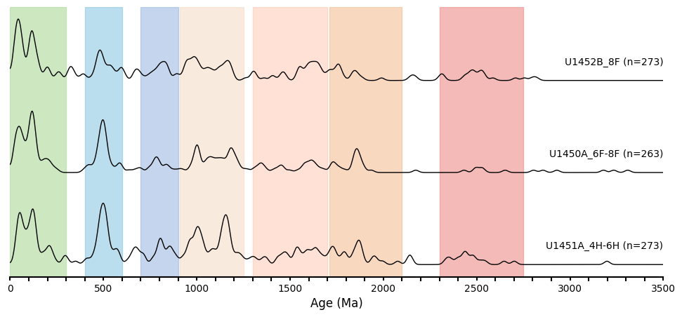
Stacked Plot with densely populated age groups noted in different colors
These are preliminary age groups in the Bengal Fan dataset, observed visually (and therefore approximate), to create a demo visualization. Accurate ages, supported by literature, will be included in future updates.
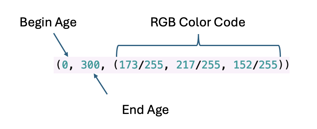
color_blocks = [
    (0, 300, (173/255, 217/255, 152/255)),   # Greenish block (A)
    (400, 600, (140/255, 200/255, 225/255)), # Light Blue block (B)
    (700, 900, (158/255, 185/255, 225/255)), # Blue block (C)
    (910, 1250, (245/255, 220/255, 200/255)), # Adjusted Light Orange block (D)
    (1300, 1700, (255/255, 205/255, 185/255)), # Adjusted Light Pink block (E)
    (1710, 2100, (245/255, 190/255, 150/255)), # Orange block (F)
    (2300, 2750, (235/255, 140/255, 135/255))  # Red block (G)
]

plot_stacked_kdes(params=param_dict, offset=1.5, color_blocks=color_blocks)

Here’s the link to the script you can run in Jupyter Notebook: KDE Plot Script on GitHub.